
1 day ago
Why Africa’s True Scale Looks Different on World Maps

Some world maps do not show the true sizes of places.
The Mercator map makes areas near the North and South Poles look bigger.
It also makes areas near the equator look smaller.
Because Africa is near the equator, it can look much smaller than it really is.
On one common map, Africa appears about as large as Greenland.
In reality, the article says Africa is about 14 times larger than Greenland.
The United Nations has suggested using maps that show areas more fairly.
Traveling across Africa can also help people understand how large the continent really is.

Traditional Mercator maps visually distort the relative sizes of regions.
The projection enlarges areas near the poles and shrinks areas near the equator.
Africa can appear roughly the same size as Greenland, although Africa is about 14 times larger.
The United Nations has suggested equal-area projections such as Equal Earth instead.
Journeys across Africa are presented as a way to understand the continent’s vast scale.
- Who
- The United Nations and people seeking to understand Africa’s geographic scale.
- What
- A discussion of how map projections distort Africa’s apparent size and how journeys across the continent can reveal its true scale.
- Where
- Africa, as represented on global maps.
- When
- The Mercator projection dates to the 16th century; the United Nations’ suggestion is described as current.
- Why
- To correct misleading perceptions of Africa’s size and promote more accurate geographic understanding.
Key facts
- Map projection discussed
- The traditional Mercator projection
- Alternative projection
- The Equal Earth projection
- Main distortion
- Mercator maps stretch areas near the poles and shrink areas near the equator.
- Size comparison
- Africa is described as about 14 times larger than Greenland.
- United Nations position
- The United Nations has suggested equal-area map projections.
- Status of the suggestion
- The suggestion is described as non-binding.
- Article’s approach
- Journeys through Africa are used to illustrate the continent’s scale.
Sources
Related news
UN Backs African Push to Correct Distorted World Maps
UN Pushes Equal Earth Maps as Mercator Faces Scrutiny
UN backs Equal Earth map, making Africa larger
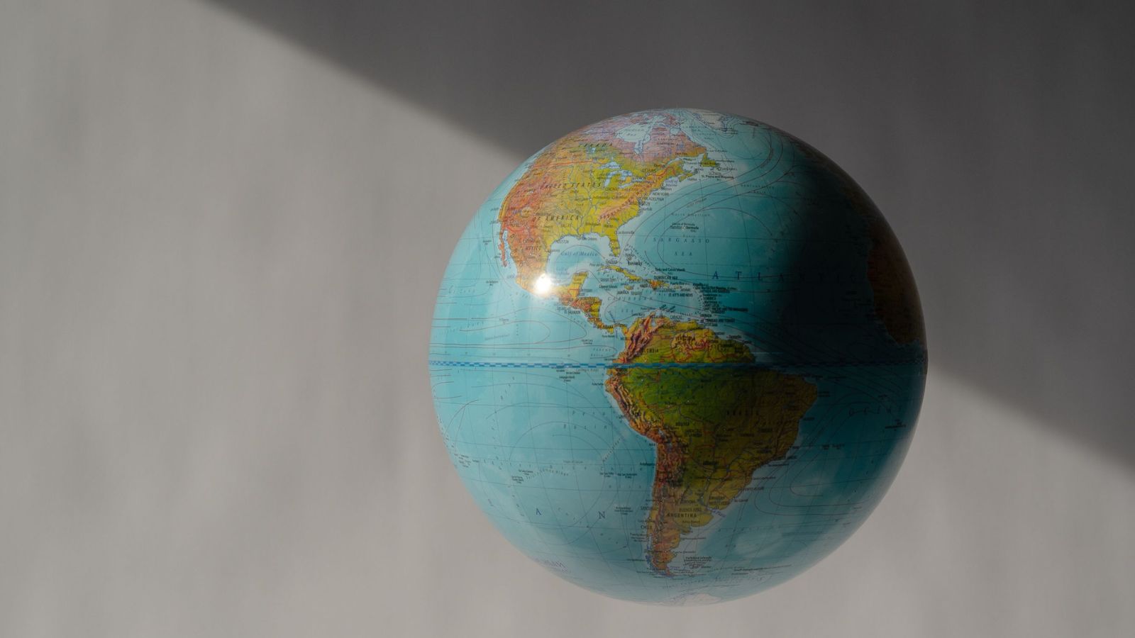
UN Backs Equal Earth Map to Show Africa’s True Scale
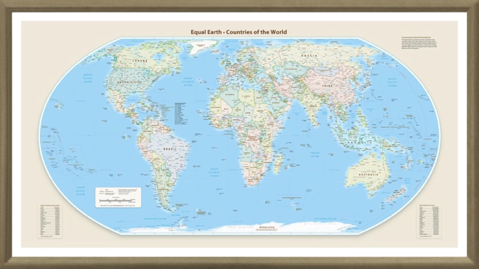
UN-backed Equal Earth Map Could Change How Travelers See Scale
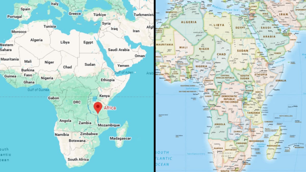
UN Backs Equal Earth Map to Correct Africa’s Distorted Image
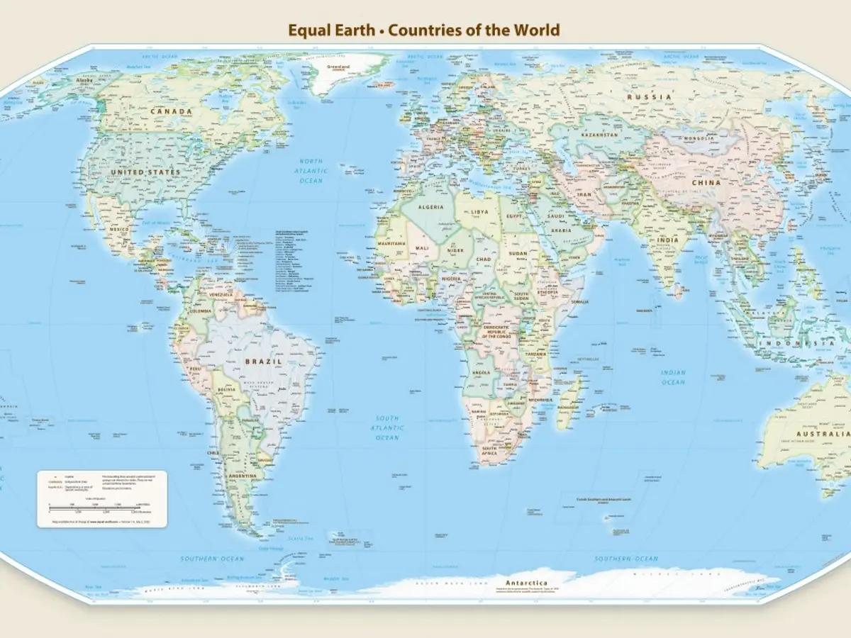
Why Mercator Maps Make Africa Look Smaller Than Reality
India Seeks Correct Jammu and Kashmir, Ladakh Map Depiction