
6 days ago
Mercator’s World Map Endures Despite Distorting Africa’s Size
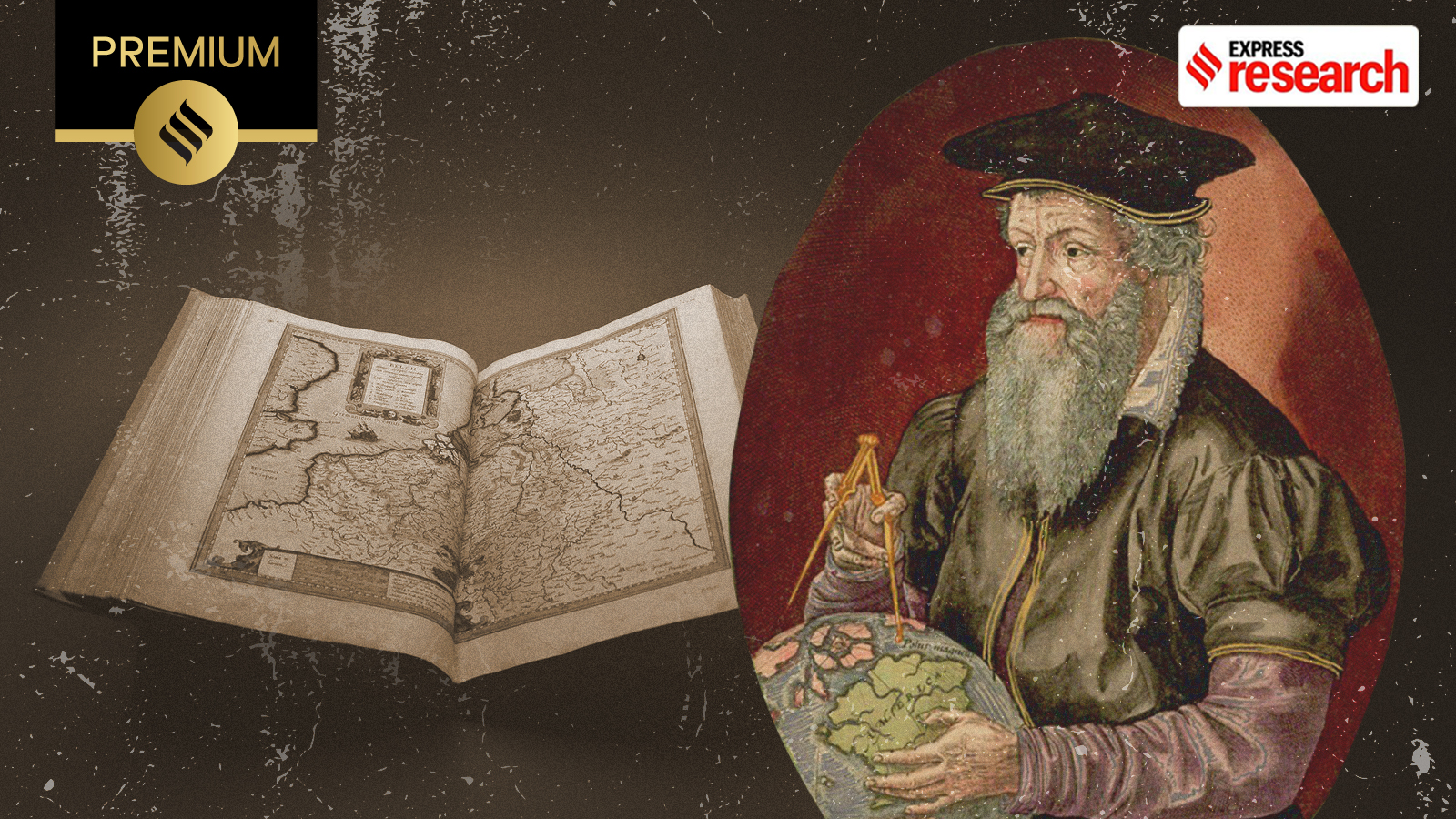
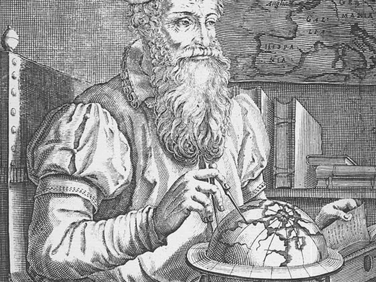
Gerardus Mercator was a mapmaker from the region that is now Belgium.
He did not travel very far, but he studied mathematics, astronomy, and geography.
In 1569, he created a flat map that showed curved routes across the round Earth as straight lines.
This helped sailors follow a steady compass direction.
The map has a major problem because it makes places near the North and South Poles look much bigger than they really are.
For example, Greenland appears almost as large as South America.
Critics say this can make Europe and other northern regions seem too important.
Supporters say the map was designed for navigation, not for comparing the true sizes of continents.
It is still used by many digital map services today.

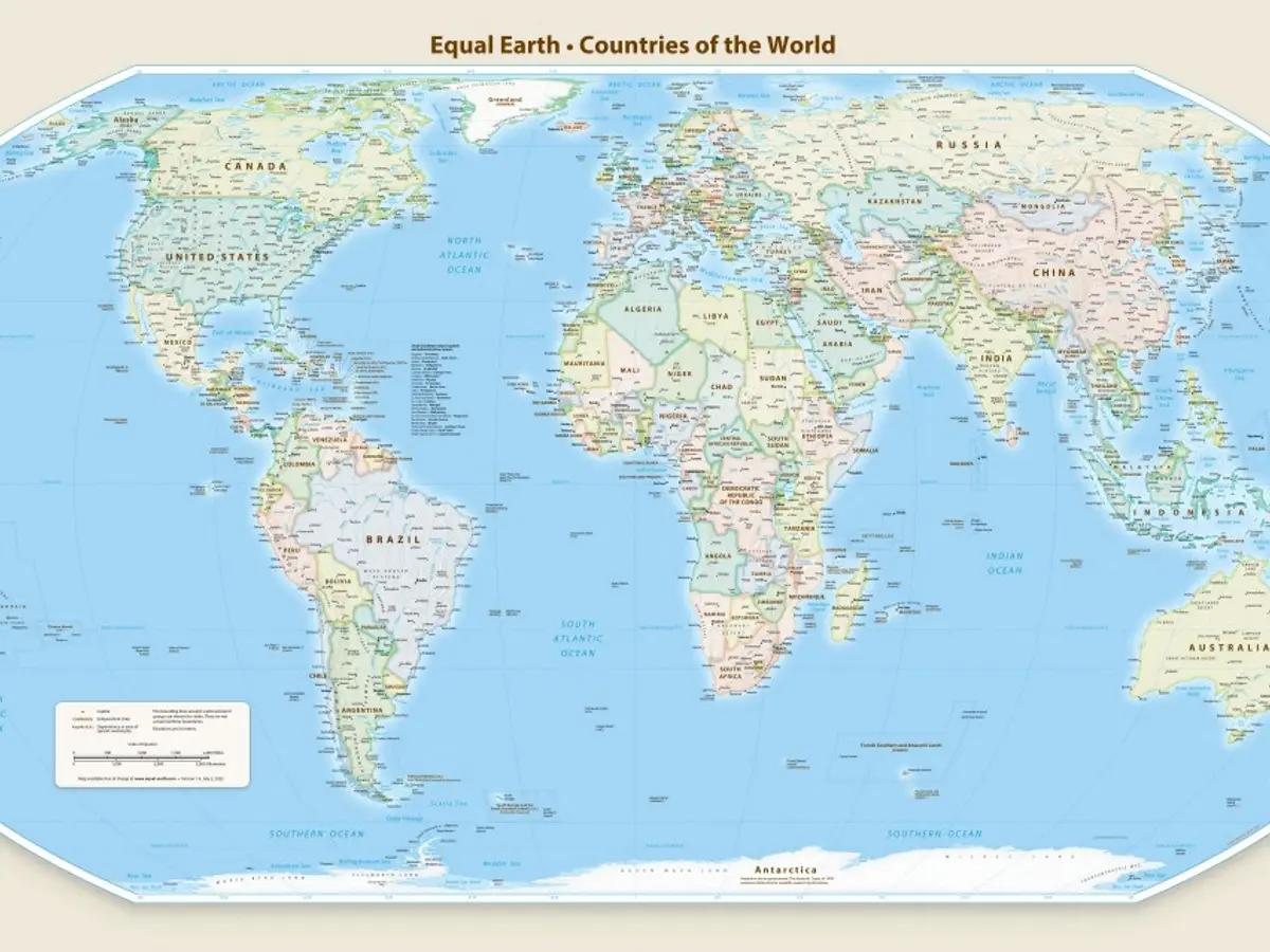
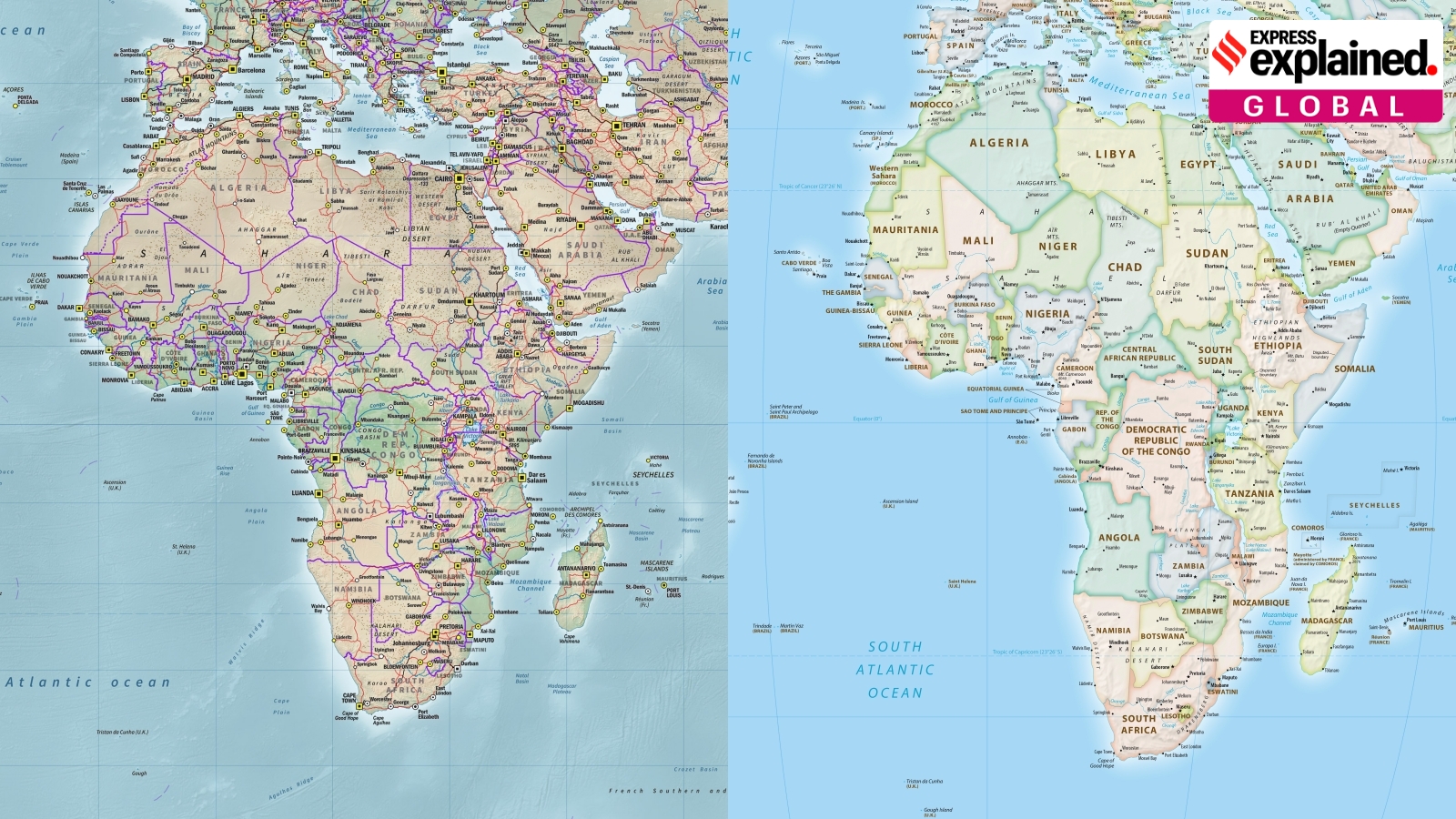
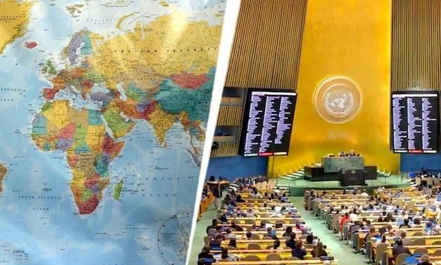
The United Nations General Assembly voted last week to replace the Mercator projection with a map showing Africa more accurately.
Gerardus Mercator created his influential 1569 projection without traveling more than about 200 kilometers from his birthplace in Rupelmonde.
The projection made constant-compass-course routes, known as rhumb lines, appear as straight lines for navigators.
Mercator’s design greatly enlarges high-latitude regions, making Greenland appear comparable in size to South America.
Despite criticism over distortion and alleged Eurocentrism, the projection remains widely used in digital mapping, including Google Maps.
- Who
- Gerardus Mercator, a Flemish geographer and mapmaker, created the projection; the United Nations General Assembly recently voted on replacing it.
- What
- The Mercator world projection is being challenged because it distorts the relative size of continents, especially Africa and high-latitude regions.
- Where
- The projection was created in the Flemish region of the modern-day Belgium area and is used in maps worldwide.
- When
- Mercator published the projection in 1569; the United Nations General Assembly vote occurred last week, according to the article.
- Why
- Mercator designed it to help navigators plot constant-direction routes as straight lines on a flat map.
Critics of the Projection
Defenders of the Projection
Size and geographic emphasis
Critics of the Projection
Critics object that the projection exaggerates high-latitude land masses, diminishes Africa comparatively, and can present a Eurocentric view of the world.
Defenders of the Projection
Defenders argue that the map was created for navigation rather than accurate comparison of land areas, and that exact proportions and polar regions were not well understood when it was made.
Whether it should remain in use
Critics of the Projection
The United Nations General Assembly’s reported vote to replace it reflects calls for a map that represents Africa’s size more accurately.
Defenders of the Projection
Supporters emphasize that the projection remains technically useful and is well suited to digital map tiles and navigation.
Mercator’s historical reputation
Critics of the Projection
Critics highlight that the map’s distortions and political implications have made it controversial, particularly since the 20th century.
Defenders of the Projection
Historian Mark Monmonier said people may be too harsh on Mercator, while the projection’s long influence reflects its practical breakthrough in mapping routes.
Key facts
- Creator
- Gerardus Mercator, born Gerard Kremer, was born in 1512 in Rupelmonde.
- Publication
- The projection was published in 1569, when Mercator was 57.
- Map format
- The original map was engraved on 18 sheets and measured more than 2 meters by nearly 1.3 meters when assembled.
- Navigation purpose
- Its conformal design represented rhumb lines as straight lines, helping mariners follow a constant compass direction.
- Major distortion
- The projection enlarges land masses at higher latitudes; Greenland appears comparable in size to South America.
- Later atlas
- Mercator’s son Rumold published the completed atlas five months after Mercator died in 1594.
- Digital use
- The projection is used by Google Maps and, in spherical interpretations, by Microsoft Bing and OpenStreetMap.
Quotes

Simon Garfield
Author of On The Map: Why the World Looks the Way it Does
“Well, what is the good of Mercator’s famous world map of 1569? It’s riddled with distortions and full of countries many times larger than they really are.”
 indianexpress.com
“Mercator’s 1569 projection may be the most influential map in the history of geography, but it was also one of the most peculiar.”
indianexpress.com
Sources
Related news
United Nations Moves to Phase Out Mercator Map
UN Pushes Equal Earth Maps as Mercator Faces Scrutiny
UN Adopts Equal Earth Map Amid Debate Over Flat-Map Accuracy
UN Backs African Push to Correct Distorted World Maps
UN backs Equal Earth map, making Africa larger