
0 months ago
Instagram Unveils Sharper, More Modern Wordmark After Decade

The word 'Instagram' at the top of the app just got a new look.
The company Meta, which owns Instagram, made this change.
The boss of Instagram, Adam Mosseri, announced the new logo on Thursday.
He shared the news on Instagram and on another app his company owns, called Threads.
He said the old wordmark had looked the same for ten years, so it was time for a refresh.
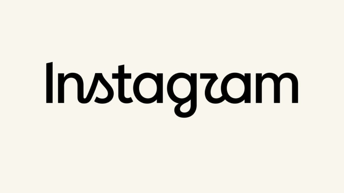
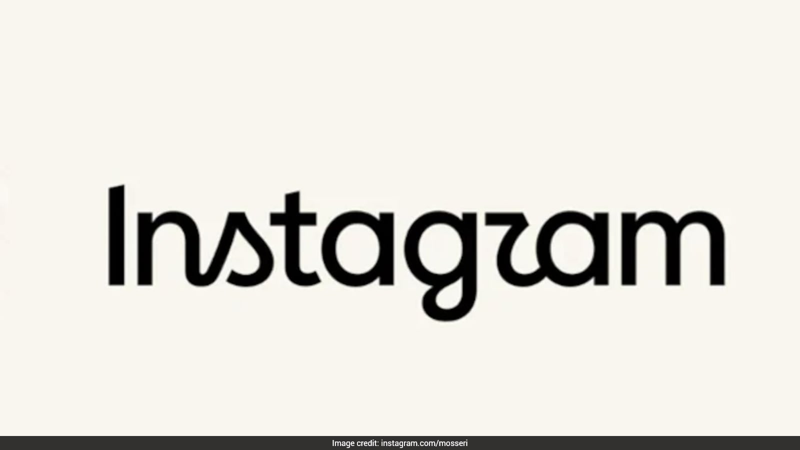
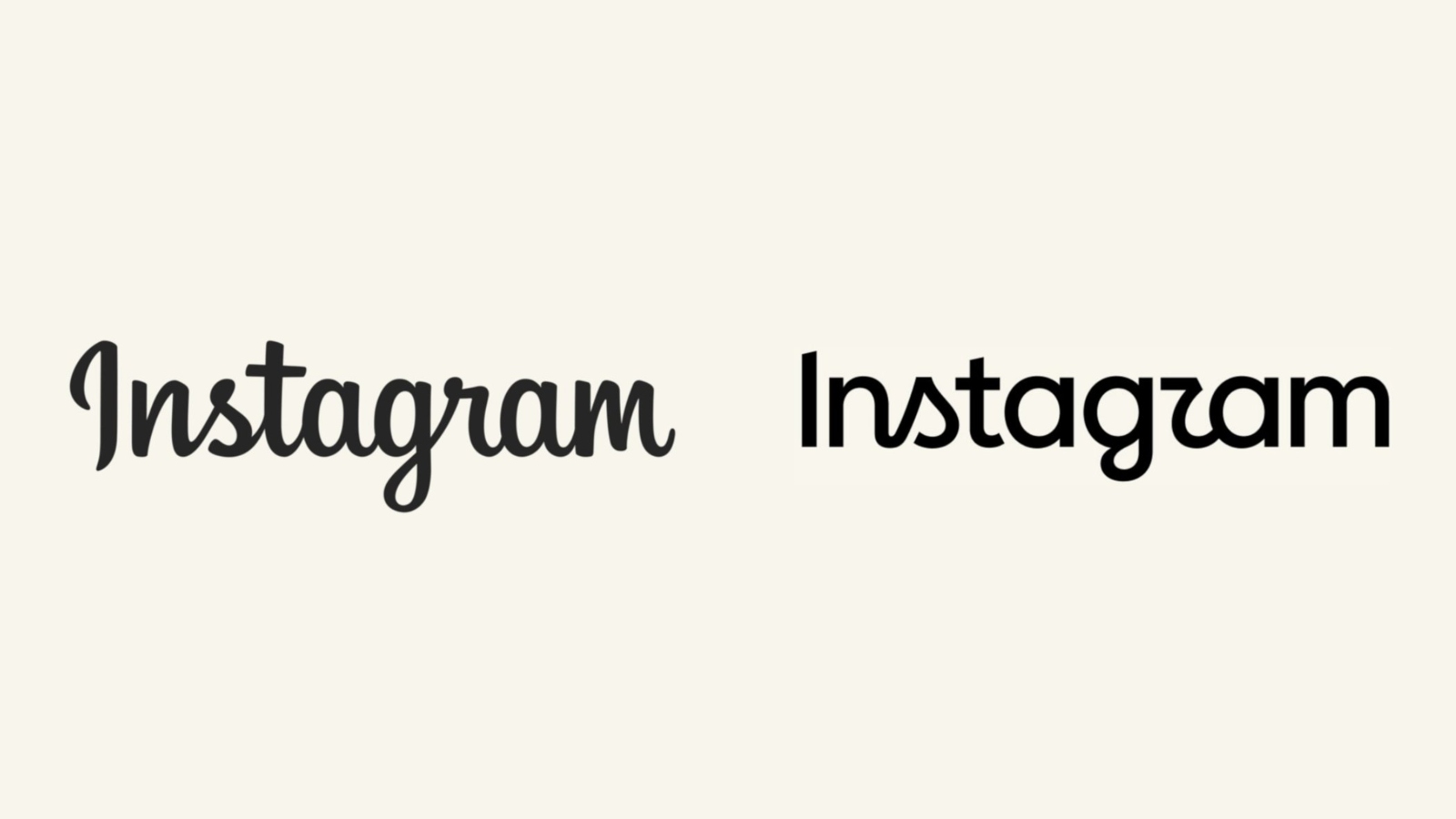
The new logo is still written in a pretty script style, but the letters were drawn again to look sharper and more modern.
The letters now mix cursive and regular writing.
This is the biggest design change since 2016, when Instagram swapped its old brown camera icon for the pink gradient one.
Some people really like the new look, but many others are disappointed and joked that it now looks like it says 'Instagzam'.
The new design also uses cursive-style curls on some letters, which some worry younger kids may not recognize.

Meta introduced a refreshed Instagram wordmark logo on Thursday, announced by Instagram head Adam Mosseri.
Mosseri described the new logo as 'sharper and more modern,' keeping the familiar script style with redrawn letterforms.
It is Instagram's first major visual update in a decade; the last redesign in 2016 swapped the brown camera icon for the pink gradient logo.
The new wordmark is a semi-cursive, semi-print hybrid, with cursive-style curves on the 's,' 'r,' and 'g.'
Reactions were mixed: some welcomed the fresher look, while many were disappointed and joked the logo reads 'Instagzam' because of the 'r.'
- Who
- Meta, with the change announced by Instagram head Adam Mosseri.
- What
- Instagram refreshed its wordmark logo for the first time in a decade, replacing the cursive script with a semi-cursive, semi-print hybrid of redrawn letterforms described as 'sharper and more modern.'
- Where
- Announced on Instagram and Threads.
- When
- Thursday; the wordmark had been unchanged for close to ten years.
- Why
- The wordmark at the top of the app had not changed in 10 years and was due for a refresh.
Supporters of the Redesign
Critics of the Redesign
New logo look
Supporters of the Redesign
The new wordmark is sharper, more modern, and cleaner, with a fresh font choice that some users welcome.
Critics of the Redesign
The mix of cursive and regular letters looks confusing at first glance, and the shape of the 'r' makes the logo appear to read 'Instagzam'.
Cursive letterforms
Supporters of the Redesign
The cursive-style curves on letters like the 's' reference the original logo and the simplicity and craft that has always made Instagram Instagram.
Critics of the Redesign
Younger generations are increasingly unfamiliar with cursive writing and may not immediately recognize the flourish on the 's'.
Readability and identity
Supporters of the Redesign
Meta says the refined version creates a cohesive, forward-looking identity across all screen sizes and interfaces.
Critics of the Redesign
The sharper curves make the logo slightly harder to read at first glance, fueling online jokes about the 'Instagzam' reading.
Key facts
- Company
- Meta
- Announced by
- Instagram head Adam Mosseri
- Announcement date
- Thursday
- Announcement platform
- Instagram and Threads
- New wordmark style
- Sharper, more modern semi-cursive/semi-print hybrid with redrawn letterforms
- Last major redesign
- 2016, when the brown camera icon with rainbow stripe was replaced by the pink gradient logo
- New platform typefaces
- Instagram Sans, Instagram Pen, and Instagram Mono
- Public reaction
- Mixed; some welcomed it, many were disappointed and joked it reads 'Instagzam'
Quotes

Adam Mosseri
Instagram head
“The wordmark at the top of the app hasn't changed in 10 years, so it was time for a refresh, cleaner and more modern, with references to the original and the simplicity and craft that's always made it Instagram.”
 deccanchronicle.com
 indianexpress.com
“"The wordmark at the top of the app hasn't changed in 10 years, so it was time for a refresh," Instagram head Adam Mosseri wrote in a post on the platform.”
 NDTV
NDTV
Sources
Instagram refreshes its identity with a redesigned wordmark after 10 years; Here’s what’s changed
Instagram Changes Its Wordmark Logo After Over A Decade
"Cleaner, Modern": Instagram Changes Its Wordmark Logo After A Decade
Why everyone is calling Instagram’s new wordmark ‘Instagzam’

Instagram Unveils New Wordmark, Calls It 'Sharper And More Modern'

Instagram Gets New Wordmark After 10 Years: Here’s What Has Changed
Related news
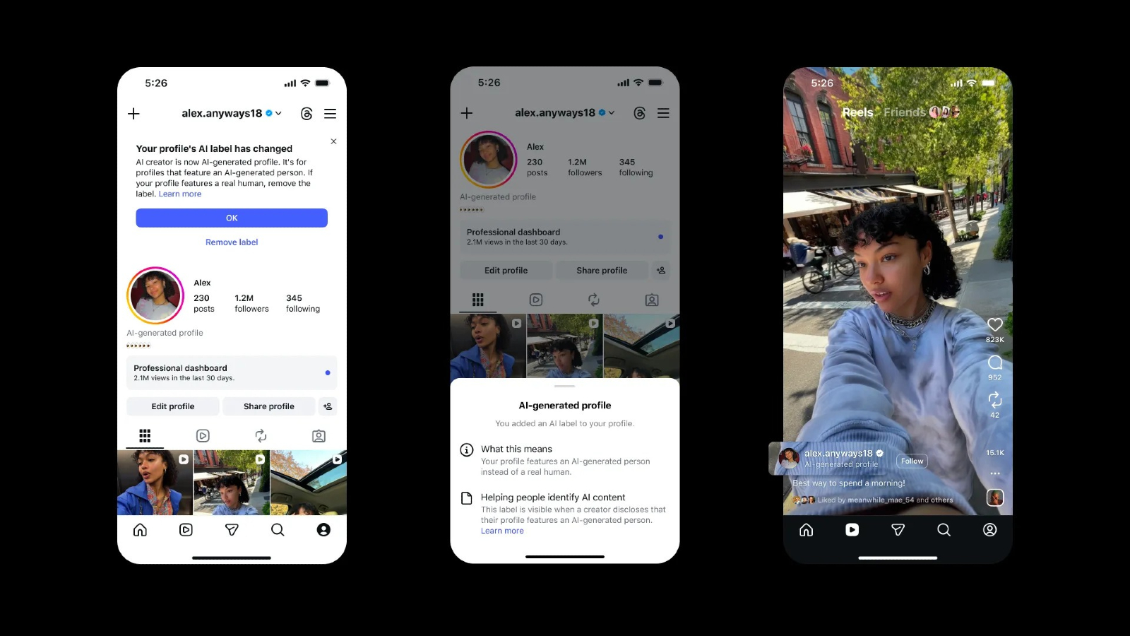
Instagram Limits Reach of Unlabeled AI-Generated Influencer Profiles

Meta Agrees to Major Youth Safety Changes After Settlement

Instagram Renames AI Creator Tag, Warns Unlabeled Profiles
Prabhas Swaps Baahubali Instagram Picture for Fauzi, Sparks Debate
CJP Instagram account restored after brief Independence Day suspension
Bengaluru Court Restores Instagram Account Suspended Over IPL Posts

Social Media Companies Intensify Efforts to Identify Child Users

Yorkville America Expands Beyond Trump-Linked ETFs With AI Strategy
Meta’s $18-Billion Child Safety Settlement Faces Praise and Criticism

School Awards Honour Courage, Commitment and Educational Excellence

AI Expansion Puts Jamnagar and Thane Under Water Stress