

Business · Companies · 54 mins ago
Zurich Zoo drops its iconic red “h” after 30 years
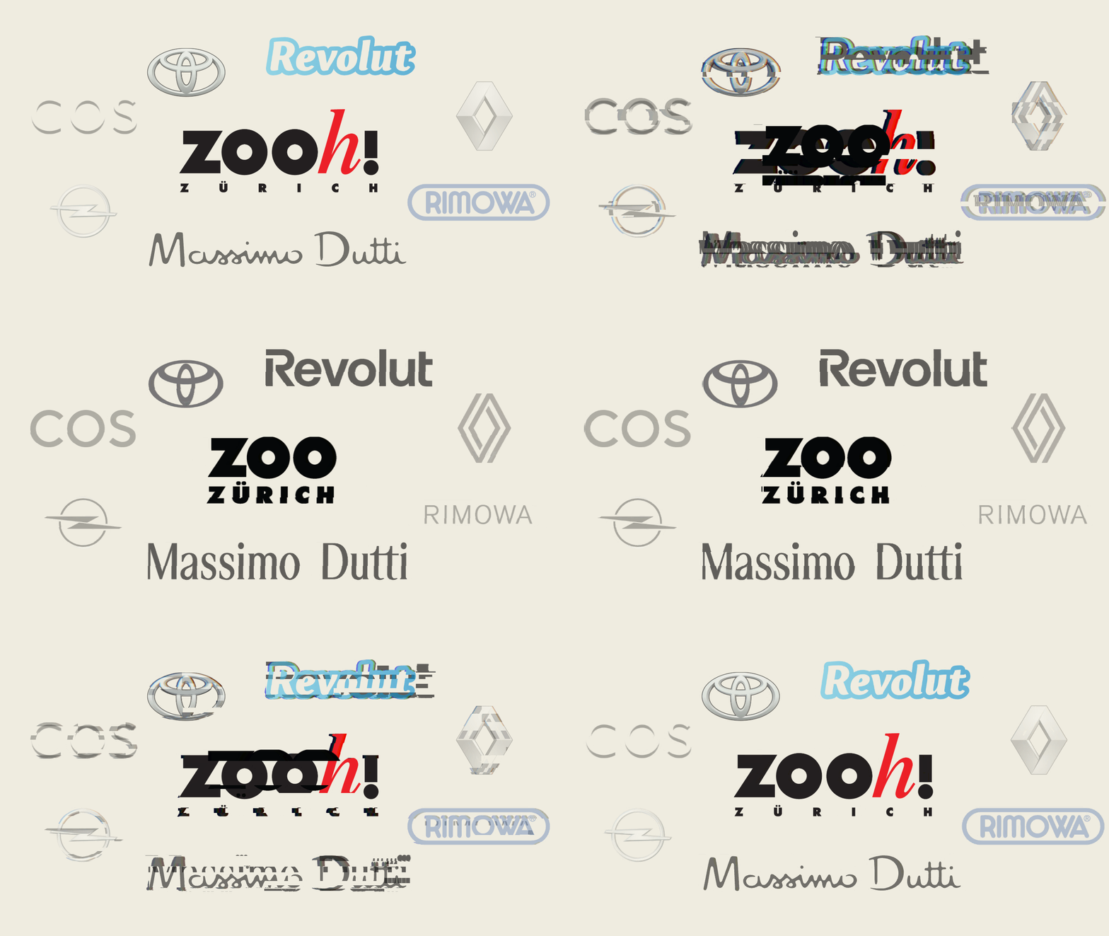
Zurich Zoo is changing its logo and removing its iconic red “h.”
The letter has been part of the zoo’s branding for 30 years.
The change follows a global trend in which many logos have come to look similar.
Some people describe such logos as soulless and interchangeable.
A design strategist explains the thinking behind the change.
No further details about the new logo or what happens next are given.

Zurich Zoo is dropping its iconic red “h” after 30 years.
The change follows a global trend in logo design.
A design strategist explains the rationale behind the decision, but the article excerpt gives no details.
- Who
- Zurich Zoo.
- What
- It is dropping its iconic red “h” from its logo.
- When
- After 30 years; the exact date of the change is not stated.
- Where
- Zurich, Switzerland.
- Why
- The zoo is following a global trend in logo design.
This story does not have two clearly opposing sides.
This story does not have a timeline yet.
- Logo element
- Iconic red “h
- Duration
- 30 years
- Location
- Zurich, Switzerland
- Reason stated
- The change follows a global trend in logo design
Sources
Related news

Givaudan quarterly organic sales beat market expectations on fragrance strength

Swiss 10-year fixed mortgage rates reach highest level since March 2025

Zimmer Biomet cuts planned Winterthur job losses to 490
Swiss home prices rose again in the third quarter of 2026

S&P cuts Zurich’s outlook to negative, keeps top credit ratings
Braunwald ski lifts remain closed after takeover offer goes unanswered
Migros adds Dallmayr coffee to its Coffee B system

Negotiation coach advises workers to name their target salary, not their minimum

Why lower oil prices have not yet cut fuel costs in Switzerland

Basel plans a new watch and jewellery fair for April 2027

Benu pharmacies join Ticino’s Rete Sant’Anna care network