

1 hr ago
McLaren Unveils Heritage-Inspired Logo Ahead of Major Expansion
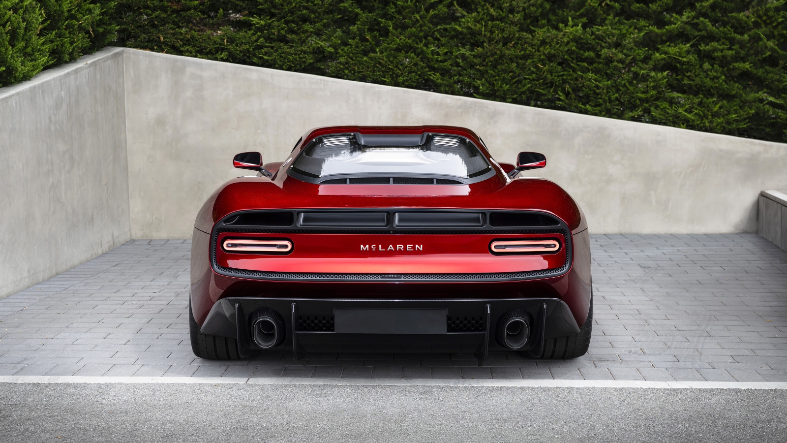
McLaren has changed the way its name looks in its logo.
The new design is being used by both McLaren Automotive and McLaren Racing.
It is not meant to erase the past.
The letters were inspired by an old sign from the McLaren family’s service station in Auckland, New Zealand.
That is where founder Bruce McLaren began building racing cars.
McLaren is keeping important symbols such as the Speedmark and Speedy Kiwi.
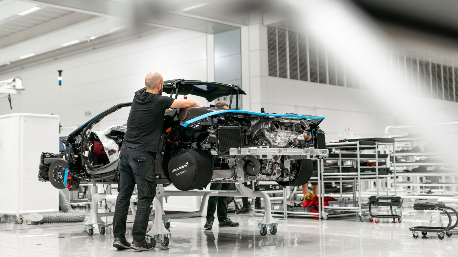
The company wants to grow by making more kinds of vehicles, including an SUV.
It also plans to invest heavily in its UK factories and engineering operations.
The reports give different currencies for the investment, calling it either £500 million or €500 million.

McLaren introduced a new wordmark for its Automotive and Racing businesses.
The lettering draws inspiration from a sign at the McLaren family service station in Remuera, Auckland.
The redesign retains McLaren’s Speedmark, Papaya finish, and Speedy Kiwi emblem.
McLaren is planning broader products, including a performance SUV, alongside expanded motorsport activities.
The company announced a major UK investment plan, reported as £500 million by one source and €500 million by another.
- Who
- McLaren Automotive and McLaren Racing, founded by Bruce McLaren.
- What
- McLaren unveiled an updated wordmark and wider visual identity.
- Where
- The heritage inspiration comes from the McLaren family service station in Remuera, Auckland, while the investment will support UK operations.
- When
- The articles do not provide an exact unveiling date; they refer to activities and plans during 2026.
- Why
- The redesign unifies McLaren’s businesses, honors its history, and supports a new phase of growth.
Key facts
- Updated identity
- A new McLaren wordmark now covers the Automotive and Racing businesses.
- Historical inspiration
- The lettering draws from a sign at the McLaren family service station in Remuera, Auckland.
- Retained symbols
- The Speedmark, Papaya finish, and Speedy Kiwi remain part of the identity.
- Planned vehicle expansion
- McLaren is preparing to expand beyond traditional two-seat sports cars, including with a performance SUV.
- Investment
- The reports describe a 500 million investment plan for UK engineering and manufacturing, but differ on whether the amount is in pounds or euros.
- Motorsport plans
- McLaren Racing marked its 1,000th Formula 1 Grand Prix and confirmed a return to top-level endurance racing through a Hypercar programme.
Quotes
David Woodhouse
Chief Creative Officer of McLaren Automotive
“This evolution of our visual identity captures that spirit. It's a reflection of the journey we are on as a company. It marks the beginning of a new chapter for McLaren, giving a physical expression to the ambition, creativity and forward momentum that is shaping our future”
 NDTV
NDTV
Sources

Related news
McLaren Plans First SUV With $675 Million UK Investment

McLaren to Create 1,000 Jobs in £450m Woking Investment

Tata Motors Launches Tata.Cars Identity, Retains Tata.ev for Electric Vehicles
Lando Norris extends McLaren deal through at least 2030
Ferrari Honors Schumacher With Special Livery For Monza Anniversary
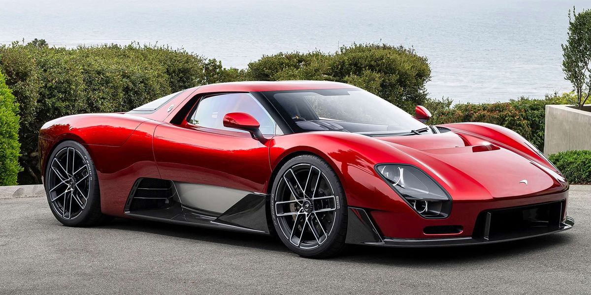
McLaren McL 6GT Concept Brings Back the Manual Gearbox
