

4 days ago
Why Luxury Homes Continue to Favor Beige and White
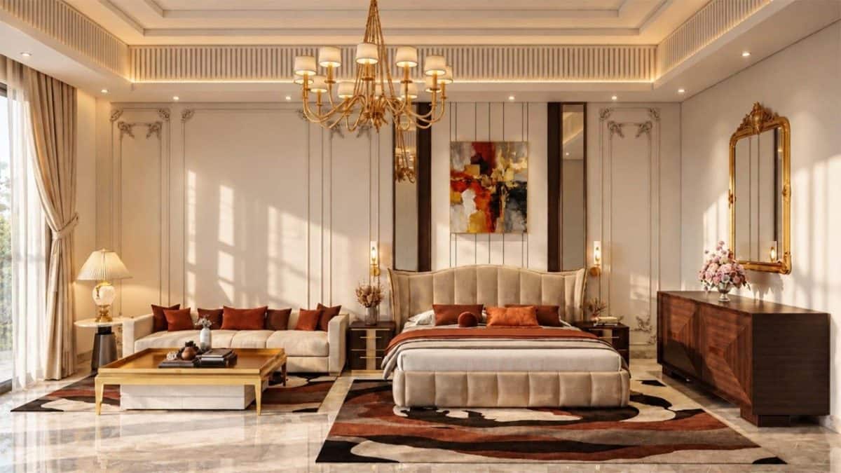
Many luxury homes are being decorated in beige, white, cream and ivory.
These gentle colours can make a room feel calm and elegant.
Designer Deena Gandhi says they also make it easier to change decorations without redoing the whole room.
Italian marble in beige or white is one flooring choice she recommends.
But interior consultant Payal Kapoor says pale rooms can be hard to keep clean in dusty places.
She also warns that a room can look dull if everything matches.
Designers can add different shades, textures, artwork or colours like sage and terracotta.
That way, a neutral room can still feel interesting and personal.

Muted shades such as beige, ivory, cream and white are popular in luxury interiors.
Designer Deena Gandhi says neutral palettes provide a timeless base for changing décor and furnishings.
Gandhi identifies beige- and white-toned Italian marble as a durable, refined flooring choice.
Interior consultant Payal Kapoor warns that dust can make pale interiors difficult to maintain and that monochrome rooms may look dull.
Designers suggest contrasting tones, textures, artwork and accent colours such as sage or terracotta to add interest.
- Who
- Interior designers and luxury homeowners, including Deena Gandhi and Payal Kapoor.
- What
- The popularity, benefits and challenges of beige- and white-led luxury interiors.
- Where
- The article discusses luxury interiors and specifically notes maintenance challenges in India.
- When
- The article describes the trend in 2026.
- Why
- Muted palettes are valued as sophisticated, adaptable backdrops, though dust and the risk of dullness can make them challenging.
Case for neutral interiors
Concerns about neutral interiors
Timelessness and flexibility
Case for neutral interiors
Deena Gandhi says neutral colours create a lasting base that allows accessories and furnishings to change easily.
Concerns about neutral interiors
Payal Kapoor cautions that a monochrome look can feel dull or uninspired if everything is too similar.
Practicality and upkeep
Case for neutral interiors
Gandhi says luxury clients accept the upkeep and notes that protective finishes and coatings can help materials withstand wear.
Concerns about neutral interiors
Kapoor says dust makes beige, white and ivory interiors difficult to maintain in India, and that the look can be more appealing in photos than in daily life.
Key facts
- Popular palette
- Beige, ivory, cream and white
- Design benefit
- Neutral backgrounds let décor, artwork and furnishings change with trends.
- Flooring mentioned
- Italian marble in beige and white tones
- Maintenance concern
- Dust can make pale interiors difficult to maintain in India.
- Risk
- Rooms with overly matching beige elements can look flat or dull.
- Suggested accents
- Soft sage, warm terracotta, varied textures and metallic finishes
Quotes
Deena Gandhi
Partner at Arkitekts Adessein, a design-driven architectural practice in New Delhi.
“A neutral colour palette provides a timeless base that allows accessories, artwork, and soft furnishings to evolve easily with changing trends. So people don’t get bored with it.”
 firstpost.com
“Excellent accent colours that go well with this palette are soft sage and warm terracotta. It can also accommodate granular textures to soft metallic finishes.”
firstpost.com
Sources
Related news
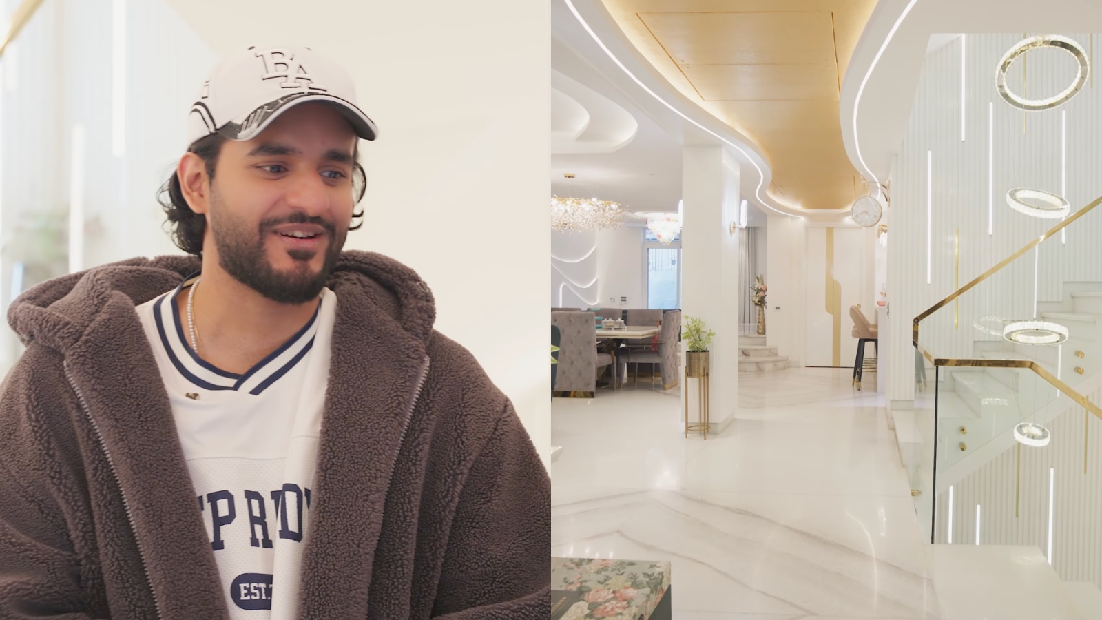
Inside Abhishek Malhan’s Ultra-Luxury Villa in Gurugram with Indoor Pool

Aashi Gupta Builds Luxury Interiors Around Timeless French Elegance

Simple Home Décor Changes That Create a More Luxurious Look

Inside Shahid Kapoor and Mira Rajput’s Warm Mumbai Home

Mallika Sherawat’s Floral Wallpaper Brings Retro Charm Home
Bengaluru Home Designers Prioritize Everyday Family Life

Rahul Gandhi Announces INDIA Bloc Protest After Delhi Crackdown Allegations

CJP Calls for Jantar Mantar Assembly Amid Detentions and Legal Challenges

Protest Against Election Chief Turns Violent Near Palika Bazar

BJP Calls Jantar Mantar Protest a Flop Show

Mass Detentions Thwart CJP Protest, Opposition Vows to Continue