

Archive · 13 Nov 2025
Google Maps Now Tracks Real-Time Air Quality in India
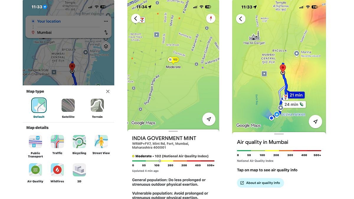
Imagine you want to play outside, but you're not sure if the air is clean enough.
Google Maps now has a special layer that shows you how good or bad the air quality is, like a color-coded map.
Green means the air is good, but if it's red or purple, the air isn't so healthy.
This feature uses information from scientists to tell you the exact number for air quality and even suggests if you should wear a mask or not.
You can find this by opening Google Maps, tapping on the little squares below the search bar, and choosing 'Air Quality'.
It's like having a superhero guide for breathing clean air, especially useful when traveling or during smoggy seasons.

Google Maps now displays real-time Air Quality Index (AQI) across India.
The feature provides color-coded AQI updates to inform users about outdoor air quality.
Users can access AQI data by updating their Google Maps app and selecting the 'Air Quality' layer.
The app shows numerical AQI scores, primary pollutants (PM2.5, PM10), and health recommendations.
AQI is color-coded from green (good) to maroon (severe) to help users assess risks.
- Who
- Google Maps
- What
- Introduced a feature to track real-time Air Quality Index (AQI)
- When
- Now available
- Where
- Across India
- Why
- To help users make informed decisions about outdoor activities amidst poor air quality issues
- Feature
- Real-time Air Quality Index (AQI) tracking
- Availability
- India
- Data Source
- Reliable environmental agencies
- Color Codes
- Green (0-50 Good), Yellow (51-100 Satisfactory), Orange (101-200 Moderate), Red (201-300 Poor), Purple (301-400 Very Poor), Maroon (401-500 Severe)
- Information Provided
- Numerical AQI score, primary pollutants (PM2.5, PM10), health recommendations