

Archive · 21 Jan 2026
Global AQI Map Highlights Pollution Hotspots
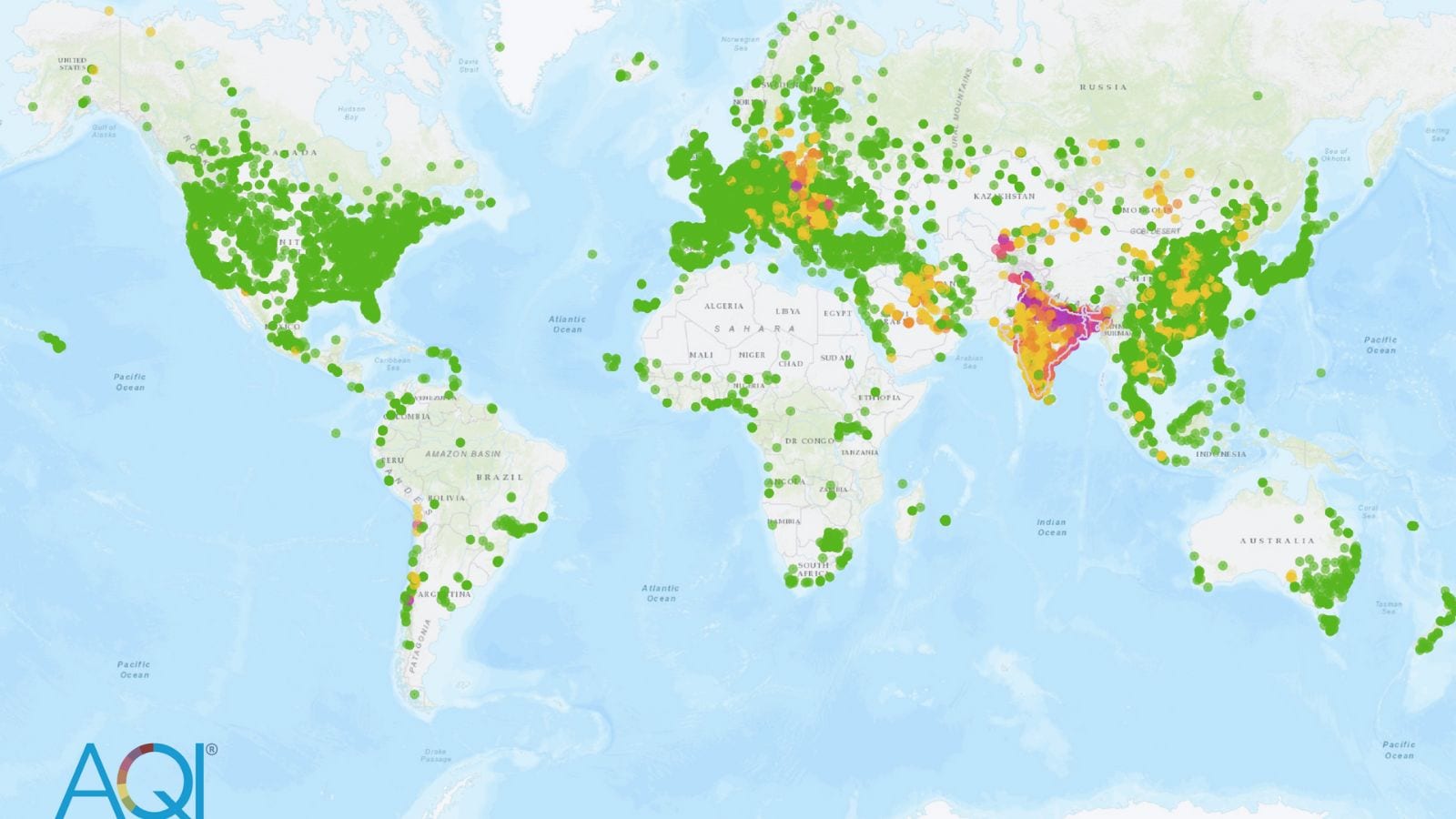
A new global map shows air pollution levels around the world using colors to represent how clean or dirty the air is.
Most of Western and Central Europe, like Germany and France, have good air quality because they have strict rules to keep the air clean.
The map helps people understand air pollution better and shows where more monitoring is needed.
The colors range from green for good air to dark red for very bad air.
This map is a useful tool for everyone to see how clean the air is in different places.

A new global AQI map provides real-time air pollution data using a color-coded scale.
Western and Central Europe have good air quality due to strict emission standards and regulations.
The AQI scale ranges from Good (green) to Hazardous (dark red).
The map highlights regions with limited air quality monitoring.
Cleaner transport systems and industrial regulations contribute to better air quality in Europe.
- Who
- Global air quality monitoring systems and the public
- What
- A newly updated global AQI map showing real-time air pollution levels
- When
- Recently updated (exact date not specified)
- Where
- Across continents, with a focus on Europe
- Why
- To provide a detailed, real-time snapshot of air pollution levels and highlight regions with limited monitoring
- AQI Scale
- Good (0–50), Moderate (51–100), Poor (101–200), Unhealthy (201–300), Severe (301–400), Hazardous (401–500+)
- Regions with Good Air Quality
- Western and Central Europe (Germany, France, Switzerland, Italy)
- Map Source
- www.aqi.in/in/air-quality-map
- Reasons for Good Air Quality in Europe
- Strict emission standards, cleaner transport systems, effective industrial regulation