
Archive · 7 Sep 2026
Why Mercator Maps Make Africa Look Smaller Than Reality
A map turns the round Earth into a flat picture.
The Mercator map was made to help sailors travel across the world.
To do this, it stretches areas near the North and South Poles.
This makes places such as Greenland look much bigger than they really are.
Africa is actually about 14 times larger than Greenland.
Critics say the map also made Western countries look more important while making Africa seem smaller.
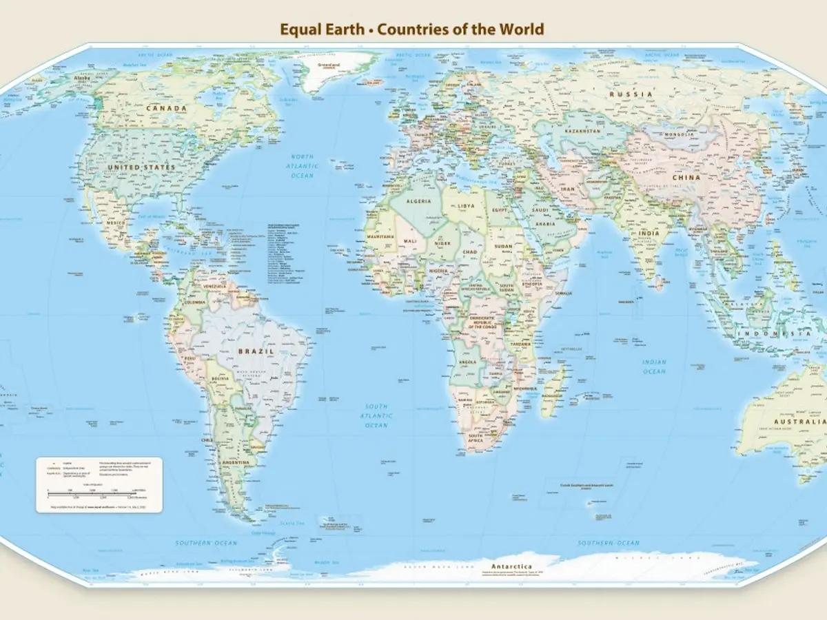
A newer map called Equal Earth shows continent sizes more fairly.
The African Union adopted Equal Earth, although the article also reports a United Nations vote to show Africa’s true size.

The Mercator map makes Africa appear similar in size to Greenland, although Africa is about 14 times larger.
Designed by Gerardus Mercator in 1569, the map helped European explorers navigate long voyages.
Its projection enlarges regions near the poles and visually minimizes areas near the equator.
Critics say the map reinforced colonial power dynamics and downplayed Africa’s resources, population, and opportunities.
The Equal Earth projection was created in 2018, and the African Union adopted it in February as a more accurate alternative.
- Who
- Cartographers, African Union member states, campaigners, and critics of the Mercator projection are involved.
- What
- A campaign seeks to replace or supplement the Mercator map with a projection that represents Africa and other continents more accurately.
- When
- The Mercator map was designed in 1569; Equal Earth was created in 2018 and adopted by the African Union in February.
- Where
- The issue concerns world maps and the way Africa is represented globally.
- Why
- The Mercator projection was designed for navigation, but critics say its distortions minimize equatorial regions and reinforce unequal perceptions of power and importance.
Mercator’s Practical Purpose
Critics’ Representation Concerns
Why the projection was created
Mercator’s Practical Purpose
The Mercator projection was designed to preserve useful navigation lines, helping European explorers chart voyages across the globe.
Critics’ Representation Concerns
Critics argue that the projection’s distortions create a misleading picture of continental size and importance.
Effect on Africa
Mercator’s Practical Purpose
Supporters of the projection can argue that its purpose was navigation rather than ranking continents by importance.
Critics’ Representation Concerns
Critics say it makes Africa appear smaller, downplays its resources and opportunities, and reflects colonial and Western power dynamics.
- Africa’s relative size
- Africa is described as about 14 times larger than Greenland.
- Mercator map date
- Gerardus Mercator designed the projection in 1569.
- Original purpose
- The projection was intended to help European explorers navigate.
- Distortion
- The map enlarges northern and southern regions and makes equatorial regions appear smaller.
- Equal Earth date
- Cartographers created the Equal Earth projection in 2018.
- African Union adoption
- The African Union’s 54 member states adopted Equal Earth in February, according to the article.
- Reported institutional action
- The article’s opening says the United Nations voted for a map showing Africa’s true size, while its later account specifically describes African Union adoption.