
Archive · 2 Jun 2025
Google Updates 'G' Logo with New Color Design
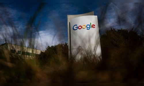
Google, the company that makes the search engine, has updated its logo, the big colorful 'G'.
The new logo has smooth color transitions instead of solid blocks.
This is the first change to the logo in almost 10 years.
The new logo is currently showing up on some phones, like Google's Pixel phones, and on some Apple devices.
The changes are currently only for the standalone 'G', and not the full Google logo.
Google is expected to roll out the new logo to more devices in the next few weeks.
The original logo was created in 2015 with a flat sans-serif typeface.

Google has redesigned its standalone 'G' logo.
The new logo features a smooth, multicoloured gradient.
The redesign is rolling out to iOS users and some Android devices.
The new logo is most visible on Pixel phones and some Apple devices.
The last major change to the 'G' logo was in 2015.
- Who
- What
- Redesigned 'G' logo
- When
- The update is rolling out now
- Where
- iOS and Android devices
- Why
- To create a more dynamic and fluid look
- Company
- Change
- Standalone 'G' logo
- New feature
- Gradient of colors
- Rollout
- iOS and Android devices
- Last major redesign
- 2015