
Archive · 11 Dec 2025
State Department Reverts to Times New Roman
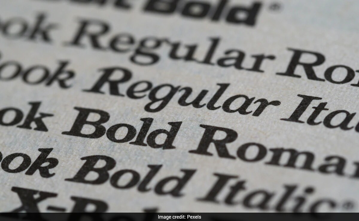
The US State Department has switched back to using Times New Roman font for official documents.
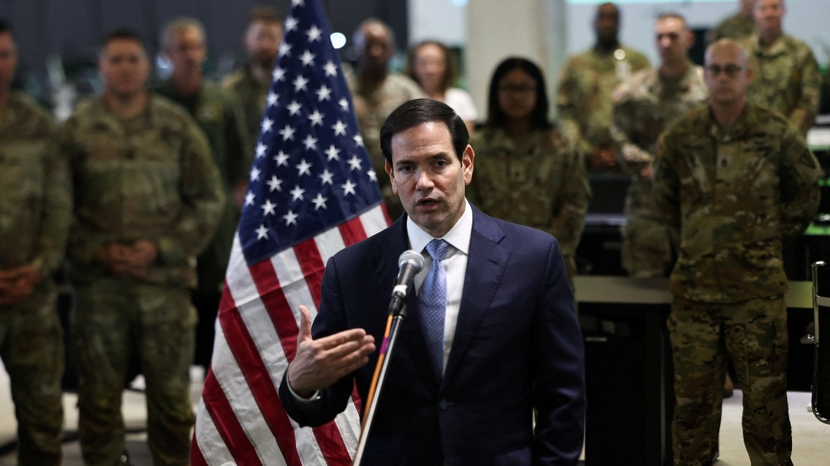
This change was made by Secretary of State Marco Rubio, who said it would make the department's work look more professional.
Before this, the department used Calibri, a different font that the Biden administration had chosen in 2023.
They chose Calibri because they thought it would be easier for people with visual impairments to read.
However, Rubio said that Calibri was too informal and that the switch didn't actually help with accessibility.
Some people on social media disagreed, saying that Calibri is actually the default font in Microsoft Word and that studies don't show a clear difference in readability between the two fonts.
The State Department defended the change, saying it ensures that official communications reflect dignity, consistency, and formality.
The designer of Calibri, Lucas de Groot, called the move both 'sad' and 'hilarious,' explaining that Calibri was designed to be more readable on modern computer screens.

US Secretary of State Marco Rubio directed a switch back to Times New Roman for official communications.
The change was made to 'restore decorum and professionalism' to the department's written work.
The Biden administration had adopted Calibri in 2023 for accessibility reasons.
Rubio's directive argues that Calibri is informal and that the switch was wasteful.
The 2023 change to Calibri reportedly cost the department $145,000.
- Who
- US Secretary of State Marco Rubio
- What
- Reverted to Times New Roman font for official communications
- When
- December 9
- Where
- US State Department
- Why
- To restore decorum and professionalism, arguing Calibri was informal and wasteful
Critics of the Change
Supporters of the Change
Font Choice
Critics of the Change
Critics argue that the change is petty and unnecessary, with some suggesting it makes documents harder to read for people with dyslexia.
Supporters of the Change
Supporters believe Times New Roman is more formal and professional, aligning with the department's need for a unified and dignified voice in communications.
Accessibility
Critics of the Change
Critics point out that Calibri was chosen for its accessibility benefits, particularly for those with visual impairments.
Supporters of the Change
Supporters argue that the change to Times New Roman ensures consistency and formality in official communications, which they believe is more important.
- Current Font
- Times New Roman
- Previous Font
- Calibri
- Change Date
- December 9
- Estimated Cost of Change
- $145,000
- Reason for Change
- Restore decorum and professionalism
- Biden Administration's Reason
- Accessibility for visually impaired
- Designer of Calibri
- Lucas de Groot
- Year Calibri Released
- 2007